Long live print communication design hot off the press
The Red Dot Award: Communication Design 2018 is in full swing. Designers, agencies and companies from all over the world can submit their works and projects in the international competition only until 15 June. In a total of 17 categories, they can put their accomplishments to the test. One of them is Publishing & Print Media. Participants have the opportunity to submit books, cards and flyers, brochures, calendars, magazines, catalogues and other printed products. Despite the progressive digitalisation, printed publications are still very important. The haptics of the material, the design quality and the composition offer a special value that distinguishes them from online publications.
High quality in print products
Print media is as alive as ever and still very strong in the competition, explains Professor Dr. Peter Zec his experiences from the Red Dot Award: Communication Design. The quality increases constantly. In the digital sector, the quality did not increase to the same extent as in the print sector. Evidently, the colleagues working in the analogue world tell themselves: Now we have to accelerate to withstand these very dynamic and exciting digital worlds. We are also able to record this in the competition, continues the initiator and CEO of the Red Dot Award. The award-winning publications impressively prove the high quality of the works.
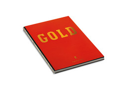
Webers golden publication
The book Gold about the history of the grill manufacturer Weber, documents the development of the brand over a period of eight years. The path towards its success is presented in the context of a collaborative creative process between the publishing house dreizeichen Verlag and the agency Fuenfwerken Design. With large-scale photographs, the layout provides readers the opportunity to experience how the repositioning of the products in the barbecue market has been achieved.
The design aims at conveying the message that the company underwent a courageous paradigm shift. It went from being a manufacturer of enamelled barbecues to becoming an authentic provider of products that stand for good food, quality and collective outdoor enjoyment. The high-quality publication depicts the journey from tool to lifestyle equipment. The open book spine in bright colors is eye-catching and enhances it optically.
The publication was awarded with a Red Dot: Best of the Best in 2017. The jury explained this decision: The design of the Gold book succeeds in striking an appealing balance between the elements of photography and content, complemented by a page division that is conclusively implemented as well. Also fascinating are its professional approach to typography, a well-harmonised choice of binding, as well as the definition of the colour scheme. Overall, this publication embodies an inspiring retrospective and an attractive showcase.
The Bible for the young generation
The re-design of the Bible was also able to obtain a Red Dot in 2017. It was designed by Grafikhelden Design Studio for the publishing house Verlag Katholisches Bibelwerk (publishing house Catholic Biblical Association), with the aim to make the work more attractive to young people. The new standard translation has been expanded by 96 pages that approach the biblical texts through questions related to everyday life, including the topics of love and relationships, work and leisure as well as fear and hope. These and many other questions are explained with the help of biblical examples. Short comments, term definitions and links to further biblical references aim at making it easy to start reading the Bible.
Robots for the good cause
To support the Polish foundation for children with cancer Krwinka, the Tofu Designstudio designed the charity calendar Robots 2017 with illustrations around the theme of robots. While the front pages of the cards are provided with multicoloured graphics for each month, the backs serve as a colouring page. Therefore, each calendar contains a pack of crayons. The project was also realised in the form of a website, where visitors can download the calendar pages, print them out and design them individually. Moreover, free sets of printed cards are provided for use in art classes in primary schools and for nursery schools.
Win over the jury
A jury of international experts will decide which works are awarded with a Red Dot. 24 jurors come together in July 2018, examine the submitted projects individually and assess them regarding their design quality and creative performance. Here, criteria such as aesthetics, originality, understandability, concept and implementation play an important role. Holger Windfuhr, Art Director of Frankfurter Allgemeine Zeitung (one of Germanys most important newspapers) and member of the Red Dot Jury 2017, answers the question of how to win over the jury with print products: Surprise me. What catches attention is work that is playful and tries to break boundaries and juxtaposes ideas with one another. Work that lets the viewer experience the message rather than just visually describing it.
» Further information and registration for the Red Dot Award: Communication Design 2018
( Press Release Image: https://photos.webwire.com/prmedia/7/225061/225061-1.jpg )
WebWireID225061
This news content was configured by WebWire editorial staff. Linking is permitted.
News Release Distribution and Press Release Distribution Services Provided by WebWire.