The power of change: Red Dot CEO Professor Dr. Peter Zec about the (re-) design of logos
The crane in Lufthansas logo is as memorable as Apples apple, Pumas big cat and Ferraris horse. Nearly everybody knows the emblems of these global brands. They are immediately associated with the respective company. The corporate design and especially the logo are a flagship for a corporation. All the more brave is it to change or renew the own visual identity, like Lufthansa recently did.
Re-design as a challenge
From his own experience, Professor Dr. Peter Zec, founder and CEO of the Red Dot Award, is conscious of the challenges which accompany the design process of a logo and its rework. When the roter Punkt (red point) became the Red Dot nearly 20 years ago, the logo design was a central aspect of the competitions reframing. The Red Dot was meant to become a dynamic quality seal and an interactively usable marketing tool that represents and speeds up alike the internationality of the award, he remembers the beginnings of todays Red Dot logo. He won over Hamburg-based designer and brand expert Peter Schmidt for this task. The design of our label was a challenge which Schmidt met by designing the Red Dot as a globe which symbolises the Red Dot World. Schmidts idea was: Red Dot orbits us and vice versa, Red Dot is the new open planet of the design worlds. Today, the Red Dot is an internationally known seal which draws attention to the awarded design quality of products and works which are marked with it.
If you once succeed in finding a logo and corporate design which brings across the brands values effectively, it is all the more difficult to adjust it to the changes of the time. Because there is a lot you have to take into account, such as the message, the clients identification with the company, the recognisability and also the parameters of the digital age, knows the design expert. Therefore, it is not surprising that the re-design of logos is often made carefully and in small steps. An example is Puma: In 2018, the sporting goods manufacturer celebrated the 50s anniversary of the logo with the well-known big cat which has hardly changed over the past decades. Already 50 years ago, the Puma logo was very elegant, later it was re-designed perfectly, explains Peter Zec.
Between the poles: re-design as a balancing act
In order to stay authentic and successful as a brand, it is especially important for the corporate design to achieve a balance of the past and the present: It is always about the tension between identity and differentiation, between tradition and innovation as well as between evolution and revolution, says Zec. With regard to design thinking, it is finally important to make the transfer of an image that has impact on product design, corporate design and packaging design on the whole brand design. This is what happened in 2013 when Nivea introduced its new design language: The iconic blue creme tin became the base of the new logo and corporate design which conveys continuity, trust and expertise, and which is recognised by consumers around the world at first glance.
Peter Zec on Lufthansas new logo
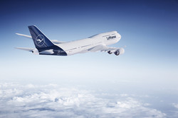
Recently, Lufthansa also dared to start a renewal. Created by graphic designer and architect Otto Firle, the airlines heraldic animal undergoes a change. The brand appearance and the logo with the stylised crane which stands for competency, open-mindedness and quality, are developed further. Much changes. Good remains, explains Lufthansa. On Thursday, 8 February 2018, a Boeing 747-8 and an Airbus A321 took off in the new Lufthansa design for the first time. It features a slimmer bird and new typography. Although blue will be the leading colour for Lufthansa, yellow wont be excluded, say Corporate Designer Ronald Wild and VP Marketing Alexander Schlaubitz about the new Lufthansa colours. Since Otl Aicher, who also designed the initial Red Dot, gave Lufthansa its well-known corporate design in 1962, it has only undergone gentle changes. All the more comprehensive is the latest advancement, which was created by Munich-based agency Martin et Karczinski, including the new typography by Hannes von Döhren.
Professor Dr. Peter Zec says about the new Lufthansa logo: Now, it is finally done. The crane in the fried egg has developed to a very elegant, yet sober and simple logo. Selecting the crane as a symbol for the best airline in the world was the perfect choice right from the beginning. Because no other bird moves as elegant in the air as the crane. Why it became the decoration of a fried egg can not be understood easily. Already Otl Aicher has criticised this very clearly. When he accomplished the re-design of the Lufthansa appearance, he did not manage to release the crane. For sure, Otl Aicher would have been very satisfied with the new design of the Lufthansa appearance. It is a harmonious design which lends Lufthansa even more prestige, conciseness and premium quality. My compliment! They did everything right.
Logos at the test
The design quality of logos is regularly put to the test in the course of the Red Dot Award: Communication Design. Corporate Design & Identity is one of 17 categories in which a jury of 24 international experts evaluates the submissions for the competition. The call for entries starts on 5 March 2018. Agencies, designers and companies around the globe are again called up to enter their current design and creative projects.
( Press Release Image: https://photos.webwire.com/prmedia/7/220136/220136-1.jpg )
WebWireID220136
This news content was configured by WebWire editorial staff. Linking is permitted.
News Release Distribution and Press Release Distribution Services Provided by WebWire.